What’s that about kerning you say?
January 25, 2011Started on typography last week. This week we had to give a presentation on six eamples of typography we liked. Here are mine… (since then, I’ve discovered that typography is more than fancy pants stuff like seen below).
Snap on Logo:
Here we have a logo for a company that provides high level tools and equipment for professional tool users. I first time encountered this logo while watching the movie Inner Space. Mr. Igoe had a snap-on hand and I’m sure the truck he stole had this logo on the side.
On examining the logo critically, I like the use of a metallic colour to emphasize the industrial nature of this company. The use of negative space to form a spanner on the leading edge is a clever hint of their tool range. The use of the power on symbol on the “O†hints of their equipment range. The simple design and smooth metallic colours implies the company is slick and modern.
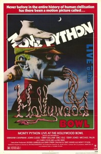
Monty Python Live At The Hollywood Bowl Poster:
The main image in this poster is what I like best. The text is arranged in such a way that is leads me through from the hand squashing Monty Python into a meat grinder, to the strings of meat directing my gaze to Live at the as well as drawing my eye down to the Hollywood formed by the strings of meat. Bowl, being at the lower right of the main image draw my eyes there last. The Monty Python is in a comic sort of font, accurately depicting this group. The use of white red and blue hint at the venue being in the USA. Overall, the text placement and the use of meat mince gives me an irreverent, and no doubt fun feel.
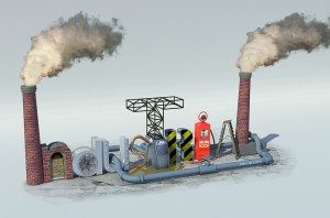
Industrial Typography:
This is a well designed image, where everything appears to fit perfectly. If Industry was written in a plain typeface, this is the sort of image that is brought to my mind. The use of brick towers to form the capital I and lower case l is quite good. The n is reminiscent of a fireplace or archway. The use of a fan and air ducting top form the d and u I find does not seem out of place. Good use is made of a hose to form an s and is a perfect link from the u to the t. The r is formed from caution striping and fits nicely. The next i is a formed by great use of an old petrol bowser, where the body forms the main shape of this letter, and the top of the pump forms the dot on top of the letter. An old step ladder forms the a. A hose running from the u to behind the final letter helps to bring the whole word together and using towers on both ends cements this. Having the s leak oil and the I and l billow smoke are nice finishing touches.
3 Peaks Challenge Logo:
This is the logo for a bicycle ride I participated in in 2010. The colours are cool, quite accurately reflecting the conditions on the day -“ freezing and wet. Not what the organised wishes to convey with this colours scheme I expect, but memorable for those who did the ride. What I like most about this logo is that 3 does double duty as an A. As this is the largest letter in the logo and my attention is drawn to it first so it is read first. Quite cleaver.
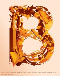
B:
I like that the B is formed by all a whole bunch of stuff that begins with b. This invites me in for a closer look to see how many items I can find. I see baseballs bats, a bass, book and building for example. The use of a caramel colour scheme means my eyes do not get tired and I can spend as long as I want looking for all the items starting with B. An entire alphabet designed this way would make a great children’s book.
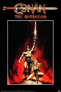
Conan Film Poster:
What I like about this use of type, is that the C mirrors the cross guard and the body of the sword impales the letters. All the text is in a tanned fleshy colour that ties in with the main image of Conan and his slave girl. This also suggests that the sword is impaling someone. The text is quite bold and strong and rendered in a pressed or worked metal serif. Combine all this, and I get the sense that Conan is a strong, tanned individual who uses his sword to get the job done in perhaps the early late iron, early bronze age. Nice work by Frazetta I assume.
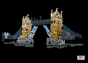
London Bridge:
Here an the attractions of an an area of London are formed into a representation of the London Bridge. I like that the colours give the impression of scaffolding, draw bridge, towers and water. I am invited to examine the text in some detail to discover what the attractions are around London Bridge. Due to this I am more likely to remember it. If I was in London figuring out what to see in the area, this would make a good flyer or billboard.
