DP027A – Apply Advanced Advertising Principles
The Brief
Design a poster campaign that discourages vandalism and grafitti and encourage more productive* persuits among 14 to 25 year olds.
*as if vandalism and grafitti can be considered produtive.
Time Allocated: 5 weeks (30 hours)
Progress
Ideas
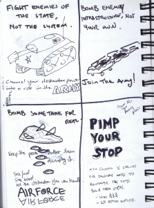
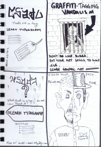
- Show el crappo scribbles with text “Seriously dude! WTF. Learn some typorgraphy skills.”
- Get yourself a chick and make babies, not atrocities
- Adolf Hitler liked to grafiti. He’s dead!
- Use your skills productively (images of other ways to paint and wreck shit)
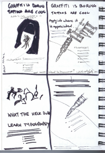
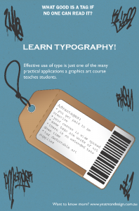
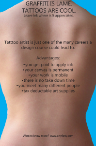
I had a play with the “apply ink where it is appreciated concept, but was not happy with the imagry. Next up, was the “learn typography” idea. This is something I grumble nearly everytime I ride under a bridge on my commute and there is really woeful tagging everywhere.
Additonal
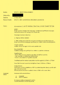
This subject was little irritating. We have had it drilled into us to follow the brief. Read the brief. Provide what the brief says. The brief looks like this:
Upon submitting my work (which was judged to be crap), it was news to 75% of the class that we had to give a presentation as well as mock up the finished art into a photo of an ad shell.
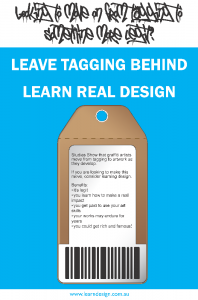
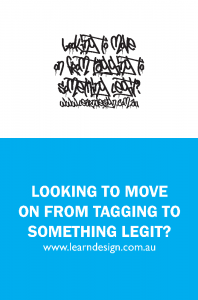
So, a week’s extension to re-do my design (more in line with the final two thumbs displayed above), alter the colours, change the type (see Assessment section), reprint and resubmit. Fun fun fun.
My work was based on a 2009 report into who vandalised and graffiti (13-30year old males, generally living at home in comfortable conditions with good education). The poster was targeted at them, not at a 40ish female who is our accessor, though our lecturer is acting in the guise of creative director in this matter so I guess she’s God in this instance.
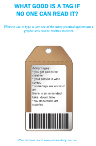
Finished Work (Version 1 – piece of crap)
Stay tuned for finished work take 2!
Assessment (take 1)
Italics are my responses/logic.
The tags look like scribble that’s the point
Too many ideas reading of tag vs typography would supposedly be too much for the mentally deficient vandals
3 different types of font – should not use more than Our typography class clearly stated no more than 3
Centre aligned, left aligned then right aligned text does not invoke flow the top centre aligned text is the teaser, the centre aligned headline is the main proposition and is in a gothic font as that’s supposed to stand out and look typographical for those not in the know. The left aligned text follows the line of the tag string, the right aligned bottom text finished of in the place that is read last
Fair enough I’ve mixed serief and sans serif and changed the alignments, but I am sure our lecturer expressed her distaste for centre aligned text in a previous class, which is why I used it once.
Use of typewriter like text on the main tag was also poo pooed the whole point of the tag was to look like it was cheap and nasty with typewriter type on it
The text relating to what a graphic arts course could will not be read if that is the case, what’s the point of any copy on an advertisement?
The tag being on an angle does not work the angle adds interest and gives those sitting in the bush shelter something interesting to look at
Oh and apparently I displayed a bit of an attitude when responding to my submission’s feedback. I am not a sheep.
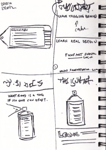
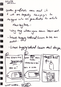
I generated some more thumbnails, as well as a series of mockups and set on the final submission below which got the big tick of approval.
Finished Work (Version 2)
To accompany my work, here is the pitch.
Assessment Take 2
Back
