C4019A – Produce Finished Art (Advanced)
The Brief
Assessment 1
Produce A Four PAGE MAGAZINE INSERT FOR the fifties fair.
INTRODUCTION
You were recently commissioned to produce a series of illustrations for an editorial piece on an upcoming Fifties Fair for HAPS (C4015A Illustrate for Design and C4018A Produce Commercial Illustrations (NOTE: we have not done this subject yet). The client loved your illustrations so much they have given you the job of creating the magazine insert to promote the Fifties Fair. They need you to design the insert using all six illustrations previously approved by HAPS and aligning the artwork with the style of the event.
Client
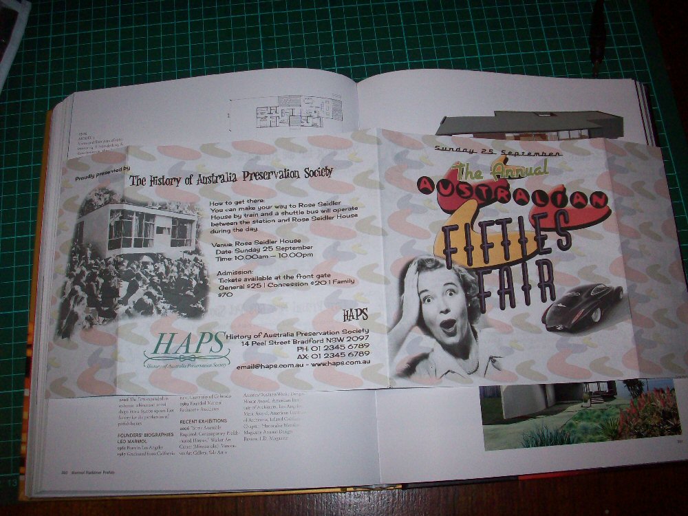
The HAPS Fifties Fair is an event that celebrates all things ’50’s: from architecture and clothing to design and lifestyle. This event is hosted as a method of encouraging Australian society to embrace the source of their history and be a part of their own story. It is the ultimate celebration of all things 1950’s in the grounds of recognised Australian heritage houses in each state. Each year entertainment includes live music to inspire and all guests are encouraged to come dressed in their best 50’s threads and collectors and dealers will be selling 50’s furniture, clothes, kitchen ware, records and much more.
As this is a very specific client you must conduct thorough research on the 1950’s retro style, the modern interpretation of the 50’s and other spin-off themes such as ‘rockabilly’ and ‘vintage’. This research will help direct your design, ensuring that you have an accurate understanding of the theme and put your own style and spin on it.
Allocated Time: 4 weeks or 24 hours
Design Rationale
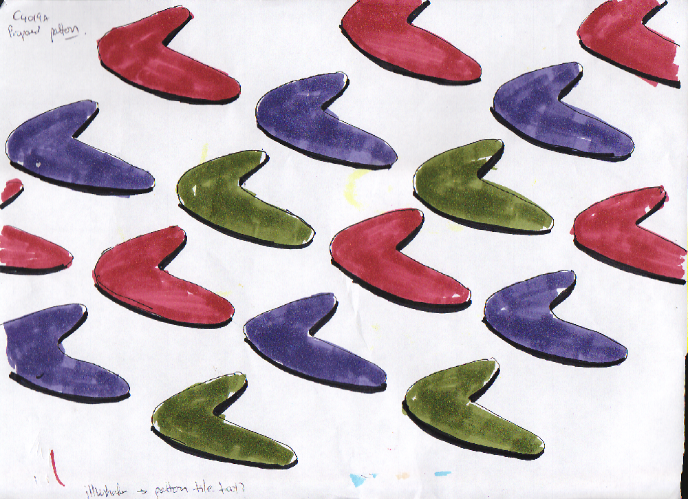
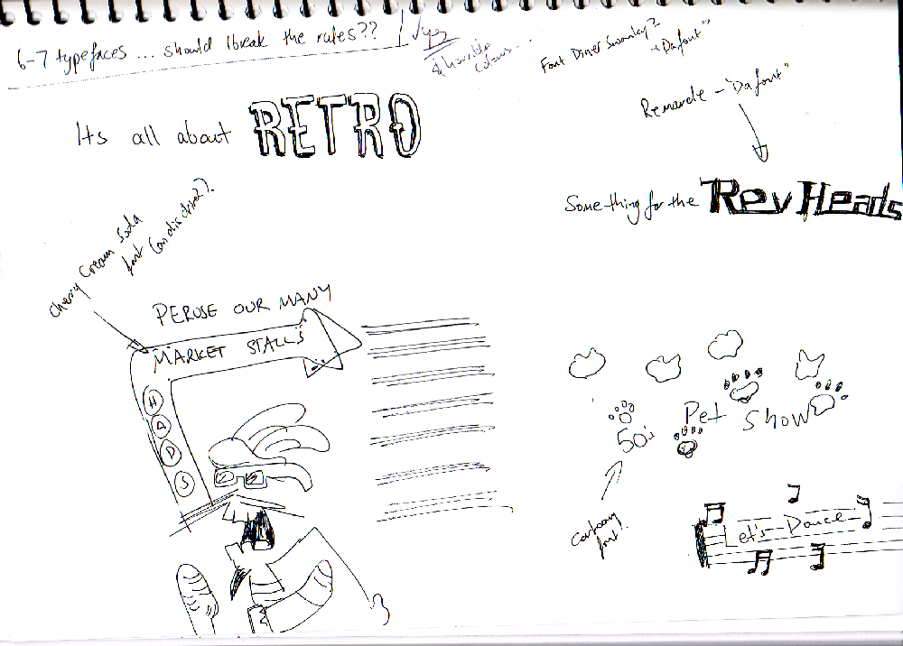
After exploring some layout thumbnails and some organic 50’s shapes, I had the idea to use a boomerang shape which would represent Australia.
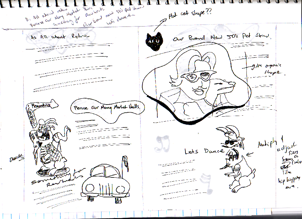
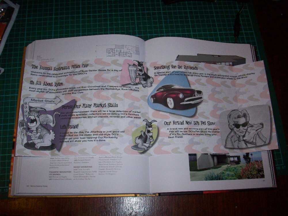
Front page: inspired by B grade horror movie. Woman is supposed to be scared, there is a fleet of boomerangs and an escaping car (a recent 50’s inspired concept (Holden) car).
Four different fonts of different sizes were used. The colours are reminiscent of the 50’s style of design – faded red, purple (echoed in car colour), orange and yellow. Many fonts as that was the done thing in the 50’s.
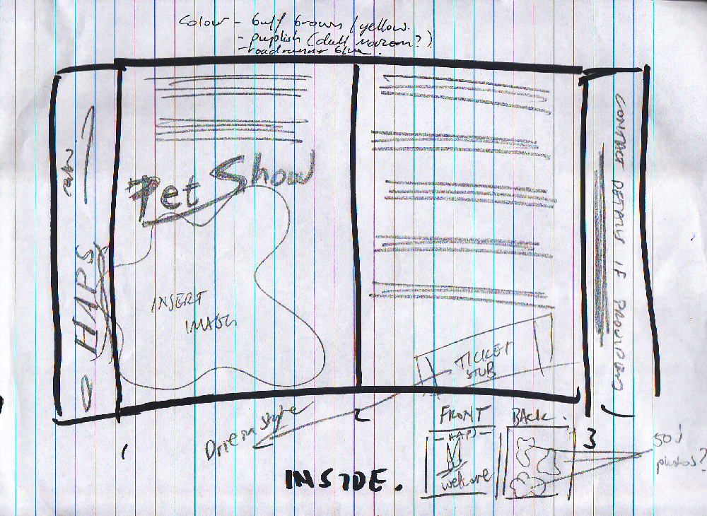
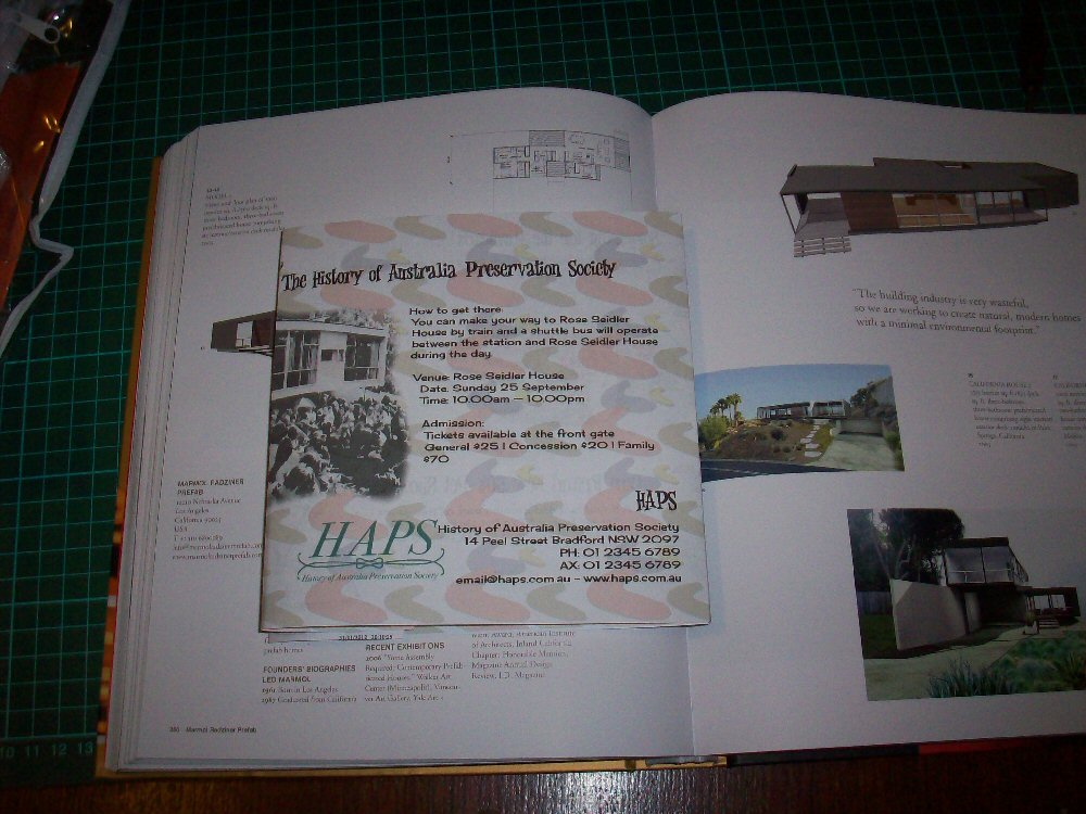
Rear page: image of Seidler house included next to details of how to get there. HAPS info included in Gutenberg presentation at lower right so people know who’s holding the event.
Inside pages; copy in order provided. Images used to support shopping (rabbit sign text changed from “Memorabilia” to “Market Stalls”. Rabbit who looks like he may be jiving positioned near “Let’s Dance”. Woman and dog positioned near info about per show. Car near info about Revheads. Car coming our of 50’s blue shape – same 50’s inspired concept Holden.
Other 50’s shapes added with drop shadow to hark back to the 50’s design sensibility. Pet drawing cropped into a 50’s shape.
I was going to go crazy with text styles for the copy, but decided to use one cartoony font for the headings and another semi cartoony, but readable font for the copy.
Background image element: Echoes the main boomerang image. Given 50’s colours and faded to 24% so it looks washed out. Means the background is non intrusive, but still looks 50ish in style and colour.
I would like more text on the RHS inner page – maybe 3 headings per inner page, but besides that, I think the brochure has turned out well.
Interestingly, we are yet to partake of the C4018A subject goodness.
Thumbnail Explorations
Click on an image to begin a slide show.

Mockups
Click on an image to begin a slide show.

Finished Work
Assessment
pending